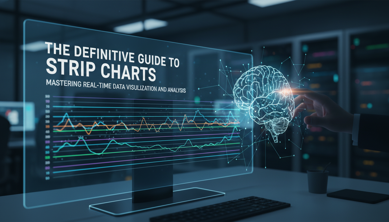
Introduction: The Pulse of Real-Time Data
In the vast ecosystem of data visualization, few tools are as immediate and impactful as the strip chart. While complex heatmaps and 3D scatter plots often steal the spotlight in boardrooms, the humble strip chart remains the workhorse of real-time monitoring. From the rhythmic beep of an ECG machine in a hospital to the oscillating CPU usage graphs on a DevOps engineer’s screen, strip charts provide a window into the now. As a senior tech writer with over 15 years in the industry, I have seen data visualization tools evolve from static reports to dynamic, living entities. Yet, the fundamental principle of the strip chart—visualizing data as a function of time—remains the gold standard for detecting anomalies, trends, and patterns as they happen.
Understanding strip charts is not just about reading lines on a grid; it is about mastering the flow of temporal information. In this definitive guide, we will dismantle the mechanics of strip charts, explore their critical applications across industries, and discuss how to implement them effectively using modern software stacks. Whether you are a financial analyst tracking high-growth stock market analysis or a developer building a dashboard, this guide will serve as your blueprint.
What is a Strip Chart?
At its core, a strip chart (often called a strip chart recorder in its analog form) is a data visualization technique where a variable is plotted against time. Imagine a long strip of paper moving at a constant speed beneath a pen that moves back and forth according to the signal it receives. The result is a continuous trace of data history.
The Anatomy of the Chart
In the digital realm, the mechanics mimic the analog ancestor but with infinitely more flexibility:
- X-Axis (Time Domain): This axis represents the temporal progression. In most software implementations, the chart "scrolls" from right to left, with the newest data appearing on the right edge.
- Y-Axis (Data Value): This represents the magnitude of the variable being measured, such as temperature, voltage, or price.
- The Trace: The continuous line connecting data points. Modern tools allow for multiple traces on a single chart for comparative analysis.
Unlike a static scatter plot, a strip chart is dynamic. It is designed to handle a stream of data where the oldest information eventually "falls off" the edge to make room for the new. This First-In-First-Out (FIFO) visualization style is crucial for systems where current status is more relevant than historical archives.
Key Use Cases Across Industries
The versatility of strip charts makes them ubiquitous. Their ability to translate raw signals into interpretable visual trends is unmatched in several high-stakes sectors.
1. IT Infrastructure and DevOps
If you have ever opened the Task Manager on Windows or the Activity Monitor on macOS, you have used a strip chart. In server monitoring, these charts visualize CPU load, memory usage, and network traffic. For cybersecurity professionals, spotting a sudden spike in a strip chart can be the first indicator of a DDoS attack or a data breach. Implementing a robust data protection strategy often involves setting up automated alerts based on thresholds defined within these real-time charts.
2. Medical Diagnostics and Healthcare
Perhaps the most iconic strip chart is the Electrocardiogram (ECG). Here, the electrical activity of the heart is plotted against time. The ability to read these charts literally saves lives. As medical tech evolves, we are seeing AI integrated into these displays to predict outcomes, connecting patterns in vital signs to broader research on intelligence and lifespan.
3. Financial Markets
Traders rely on tick charts—a variation of strip charts—to make split-second decisions. While candlestick charts are popular for longer timeframes, the strip chart format is essential for visualizing high-frequency trading algorithms where every millisecond counts.
4. Audio and Signal Processing
In audio engineering, waveforms are essentially strip charts of amplitude over time. Whether you are mixing a track or using the best app for audio file cleaner for PC, you are interacting with a visual representation of sound waves to identify and remove noise.
Designing Effective Strip Charts: A UI/UX Perspective
Creating a functional strip chart requires more than just plotting points; it requires a deep understanding of user interface design. A poorly designed chart can lead to "alarm fatigue" or misinterpretation of data.
Managing Data Density and Latency
One of the biggest challenges in modern web development is rendering real-time charts without bogging down the browser. When dealing with high-frequency data (e.g., 60Hz sensor readings), rendering every single point can crash the DOM. Strategies include:
- Downsampling: Visualizing averages rather than raw data points when zoomed out.
- Canvas vs. SVG: Using HTML5 Canvas for high-performance rendering instead of SVG nodes.
- Buffering: efficient data structures to manage the flow of incoming data.
For developers focusing on high-authority dashboards, following principles of PickUI mastery and component architecture is essential to ensure that the visualization is both aesthetic and functional.
Color Coding and Context
A line on a graph means nothing without context. Effective strip charts use:
- Threshold Lines: Horizontal lines indicating safe operating limits (e.g., a red line at 90% CPU usage).
- Dynamic Coloring: Changing the line color from green to red as it crosses a threshold.
- Gridlines: Subtle guides to help the eye align values without cluttering the view.
Strip Charts vs. Histograms and Scatter Plots
To master data analysis, one must know which tool to pick. Here is how strip charts compare to their counterparts:
Strip Chart vs. Histogram
A histogram groups data into bins to show frequency distribution (e.g., how many users visited between 1 PM and 2 PM). A strip chart shows the exact sequence of events. Use a histogram to understand distribution; use a strip chart to understand sequence and progression.
Strip Chart vs. Scatter Plot
A scatter plot typically compares two variables (X vs. Y) to find correlations. While a strip chart technically plots Value vs. Time, its primary purpose is monitoring. If you are trying to find if there is a correlation between CPU heat and fan speed, a scatter plot is better. If you want to see when the fan turned on, use a strip chart.
Implementing Strip Charts in Modern Stacks
For those looking to build their own, the ecosystem is rich with libraries.
Excel and Spreadsheets
Believe it or not, you can create strip charts in Excel. While not "real-time" in the millisecond sense without plugins, using dynamic named ranges allows a chart to update as new rows are added. This is often the first step for small business analytics.
JavaScript Libraries (D3.js, Chart.js, Recharts)
For web applications, D3.js offers the most control but has a steep learning curve. Libraries like Chart.js or Recharts provide a wrapper that makes implementing streaming charts significantly easier. When building these components, ensuring they are responsive is key. Just as you would optimize a blog layout—perhaps using advanced blogging strategies for content presentation—you must ensure your charts resize gracefully on mobile devices.
Frequently Asked Questions
1. What is the difference between a strip chart and a trend line?
A trend line is usually a mathematical regression drawn over a scatter plot to show general direction. A strip chart is the raw plotting of actual data points over time. The strip chart shows the reality; the trend line shows the mathematical approximation of the direction.
2. Can I use strip charts for non-time-series data?
Generally, no. The defining characteristic of a strip chart is the temporal axis (time). If you replace time with distance (e.g., plotting elevation along a road), it is technically a profile graph, though it looks similar.
3. How do I optimize a real-time strip chart for performance?
Use WebGL or HTML5 Canvas instead of SVG for large datasets. Implement a circular buffer (ring buffer) data structure so you don’t have to re-allocate memory constantly. Limit the number of visible points (e.g., only show the last 60 seconds).
4. Are strip charts useful for AI and Machine Learning?
Absolutely. In Reinforcement Learning, strip charts are used to monitor the "reward" signal over episodes. They help engineers see if the model is learning (trend going up) or diverging (chaotic oscillation).
5. What is the best color scheme for a dark-mode dashboard?
High-contrast neon colors (cyan, magenta, bright green) work best on dark backgrounds. Ensure you avoid red/green combinations without distinct brightness differences to accommodate color-blind users.
Conclusion
The strip chart is a testament to the idea that sometimes the simplest solution is the most powerful. In an age dominated by complex AI algorithms and massive datasets, the ability to visualize the "now" remains indispensable. Whether you are monitoring the heartbeat of a patient or the heartbeat of a server cluster, the strip chart provides the clarity needed to act decisively.
As we move forward, integrating these visualizations with predictive analytics will be the next frontier. By mastering the principles outlined in this guide—from understanding the X-Y axis mechanics to implementing high-performance rendering—you place yourself at the forefront of data proficiency. Remember, data is only as good as your ability to see it, understand it, and act on it.

The editor of All-AI.Tools is a professional technology writer specializing in artificial intelligence and chatbot tools. With a strong focus on delivering clear, accurate, and up-to-date content, they provide readers with in-depth guides, expert insights, and practical information on the latest AI innovations. Committed to fostering understanding of fun AI tools and their real-world applications, the editor ensures that All-AI.Tools remains a reliable and authoritative resource for professionals, developers, and AI enthusiasts.